Case study: Newton PMS
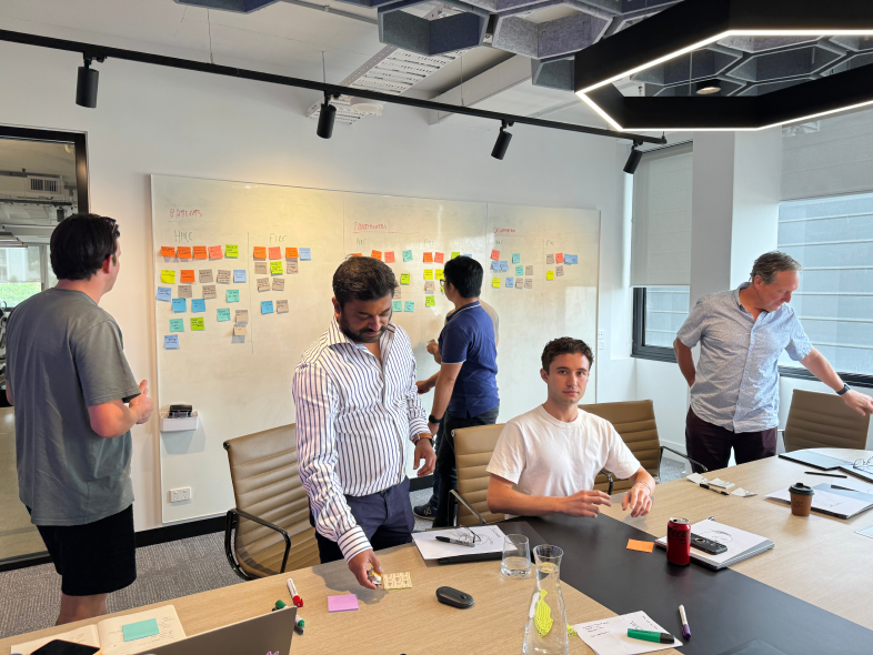
Australia’s largest health insurer uses Newton as their Practice Management System, facilitating their General Practitioner telehealth service. As Senior Product Designer I designed new and improved existing features from concept to production. Executing key improvements to our design ops processes, I reimplemented a fragmented Design System and established process standards.
Product design lead
Design ops
Research and analysis
The challenge
Newton faced several challenges that impacted usability, readiness for launch, and scalability.
Multiple design systems in use
Newton’s front end was built using Material UI (MUI) and customised for bespoke designs, which were not based on a DS and had since been abandoned. While designers had adopted Untitled UI, engineers were unsure how to adapt the codebase and continued building with MUI, using the new designs as a guide, causing inefficiencies, inconsistencies and misaligned expectations.
Poor navigation design
The navigation had several issues, with inconsistent patterns, a flat design, limited progressive disclosure and poor visual hierarchy all contributing to an unintuitive and cluttered experience. A multi-tab approach to navigation allowed GPs to keep multiple Patient Files open and complete consult notes later in the day, but this led to inaccurate time tracking and inefficiencies.
System not optimised for telehealth
Newton’s original design was based on physical practice software. In physical practices, practice admins help manage tasks related to Patient Consults, such as Billing. In a telehealth context, many of these admin tasks, can be automated, or simplified and completed by doctors.
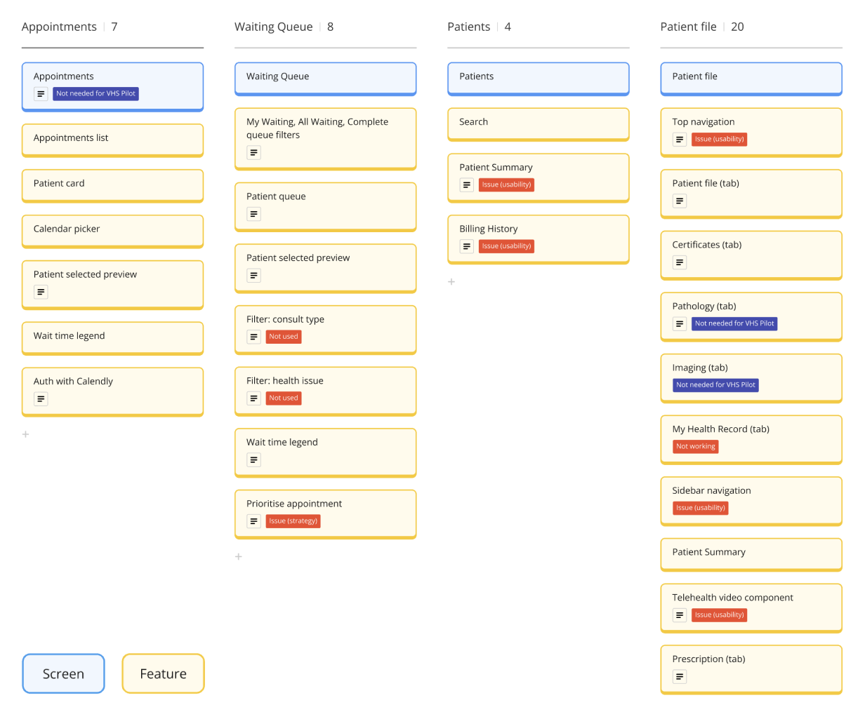
Heuristic Evaluation
Identified usability pain points and areas for improvement, using Jakob Nielsen’s 10 usability heuristics as a framework.
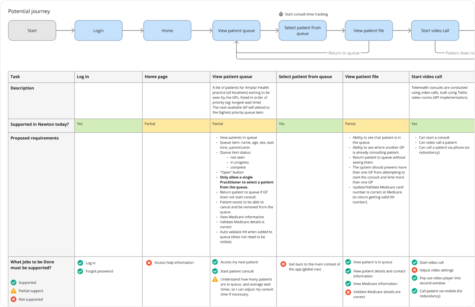
Journey mapping and gap analysis
Evaluated existing and proposed future-state journeys against product requirements to assess how effectively the current product and strategy supported the key jobs to be done, while identifying gaps in the solution.
Fixing the design system
Problem
I reviewed Newton’s front end to see how MUI had been implemented and experimented with its configuration, reviewed the customisations that had been made and evaluated alternatives like ANT, Chakra UI, and Tailwind CSS. This revealed a few insights:
- MUI was deeply embedded in the front-end components, and it seemed likely it would be a significant undertaking to decouple MUI from Newton’s business logic and swap in another DS.
- Removing the customisations to MUI would be fairly straightforward.
- MUI was fully capable of supporting our design vision.
Solution
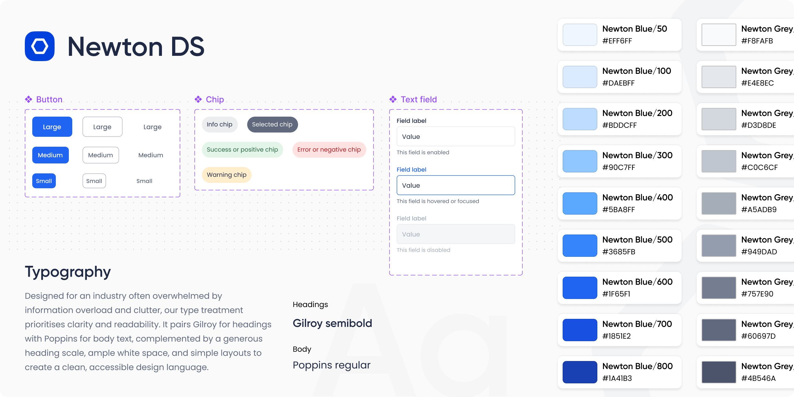
Based on the findings, I recommended the most efficient solution would be to embrace MUI, remove customisations and apply a simple theme.
I developed a minimalist design language, featuring a monochromatic colour palette, strong typography, and generous white space. Using the official MUI Figma Kit, I lightly themed it to align with our updated design language, establishing it as our core Figma library.
To support implementation, I documented the new designs and worked with engineers to remove customisations and apply the updates.
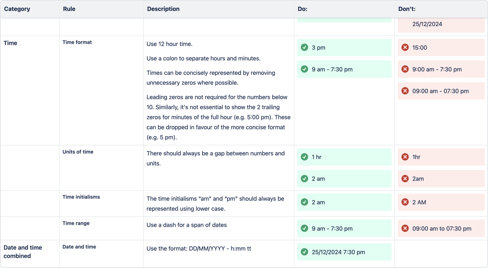
Content style guide
To ensure consistent copy across the app, after delivering the updated design system I also developed a content style guide.
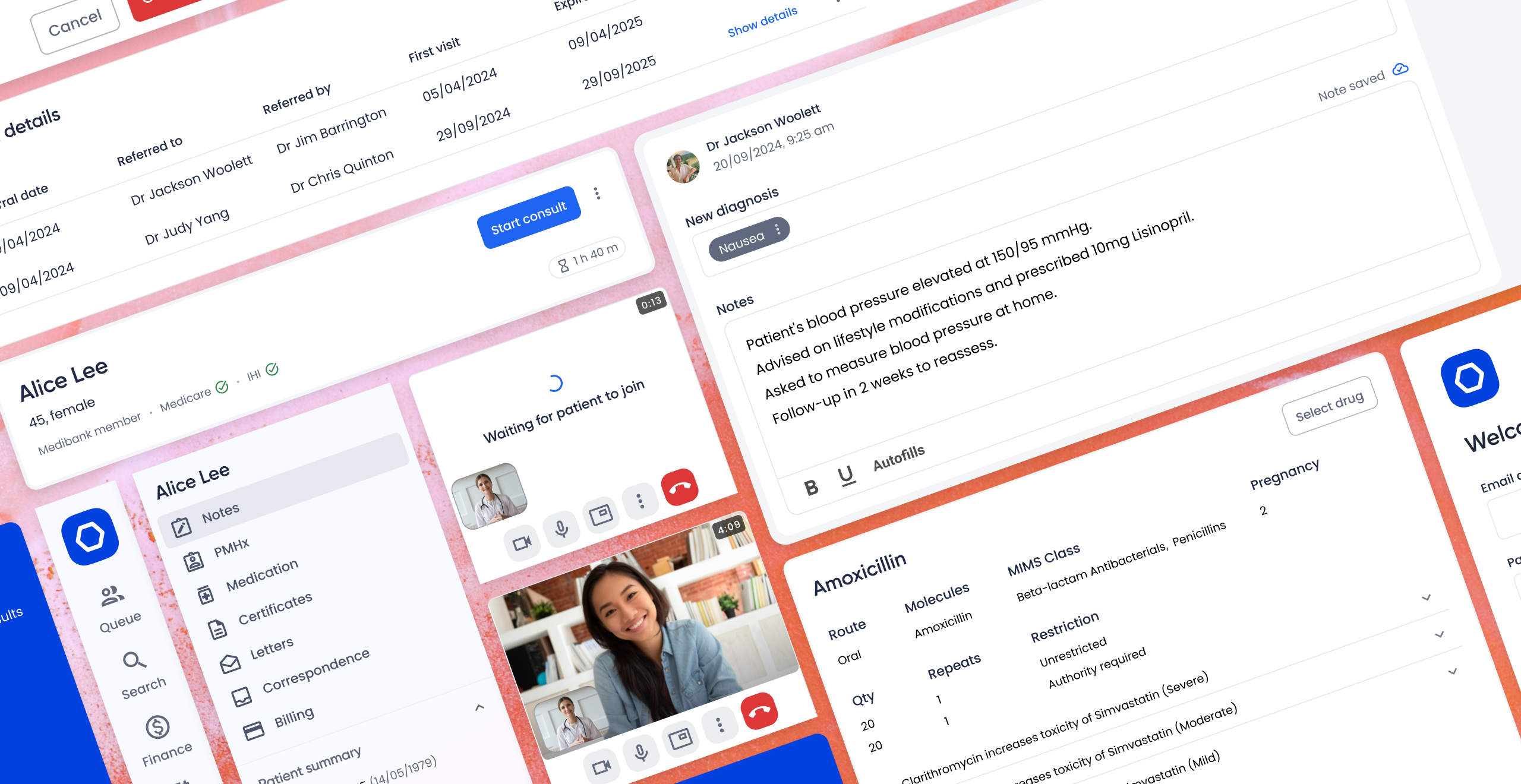
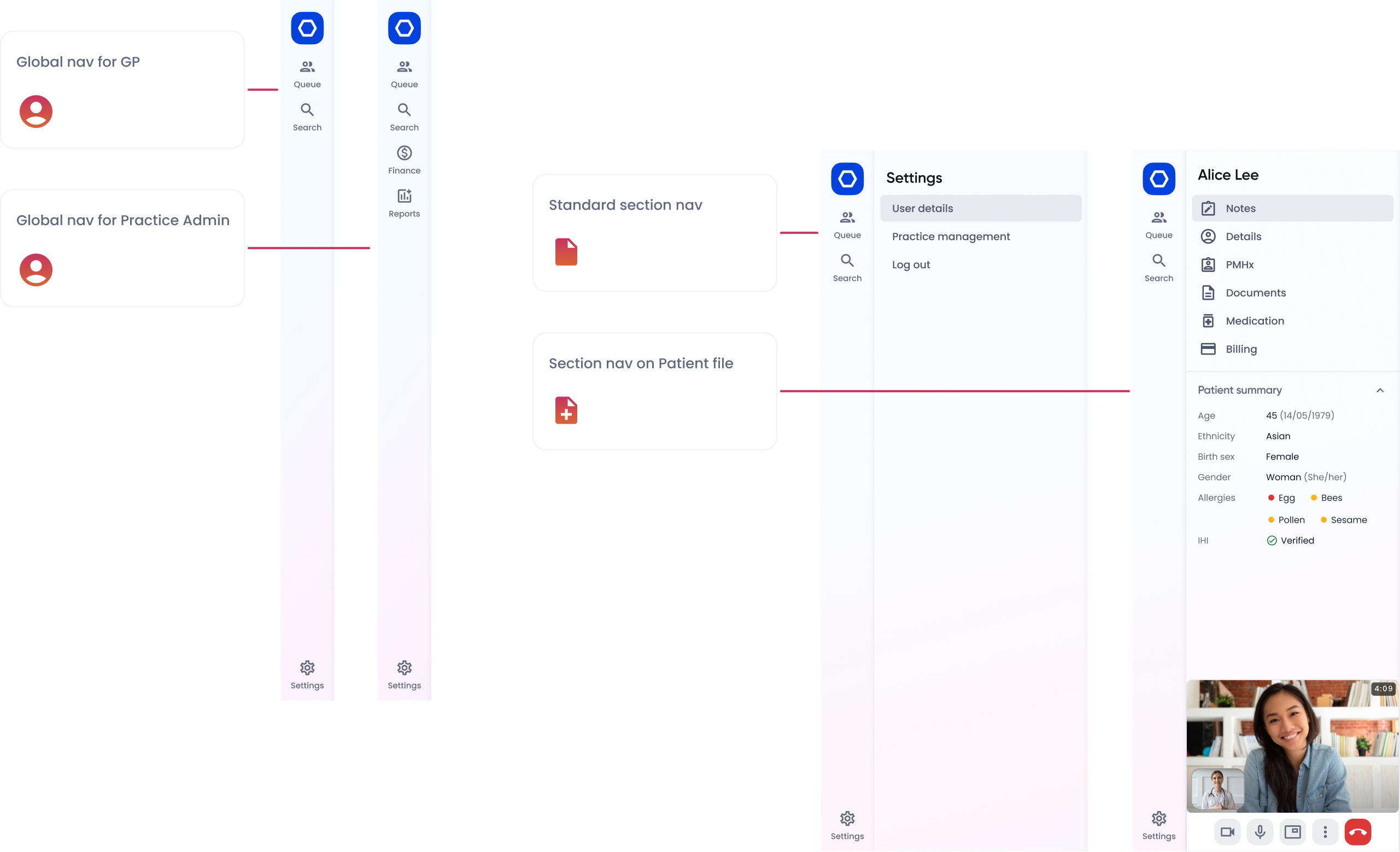
Redesigning the core navigation
Problem
A deep dive into the IA revealed opportunities to consolidate features and declutter experiences using progressive disclosure.
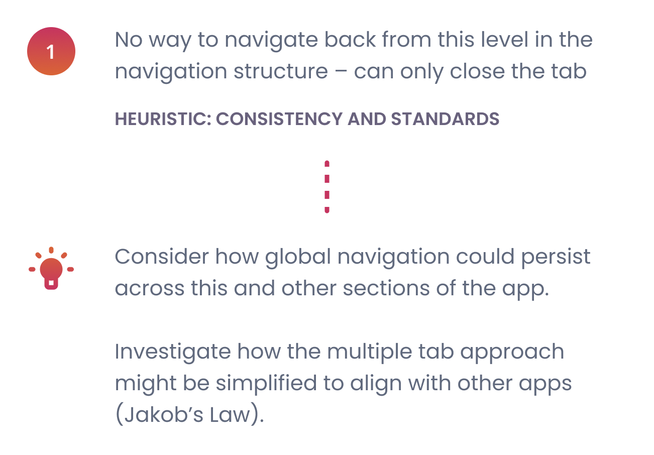
Stakeholder interviews uncovered that Newton was originally designed as a desktop app and later redeveloped for web. The app’s multi-tab navigation, a legacy desktop pattern, allowed GPs to keep multiple patient files open simultaneously, but created several issues:
- Time tracking for how long GPs work on patient files was inaccurate.
- When the app was redeveloped for web the application tabs became browser tabs, creating a fragmented experience in the Patient Consult journey, with GPs navigating between browser tabs to complete the flow.
- The Patient File opened without global navigation options, creating a dead end for the user, with the only option to close the browser tab.
Solution
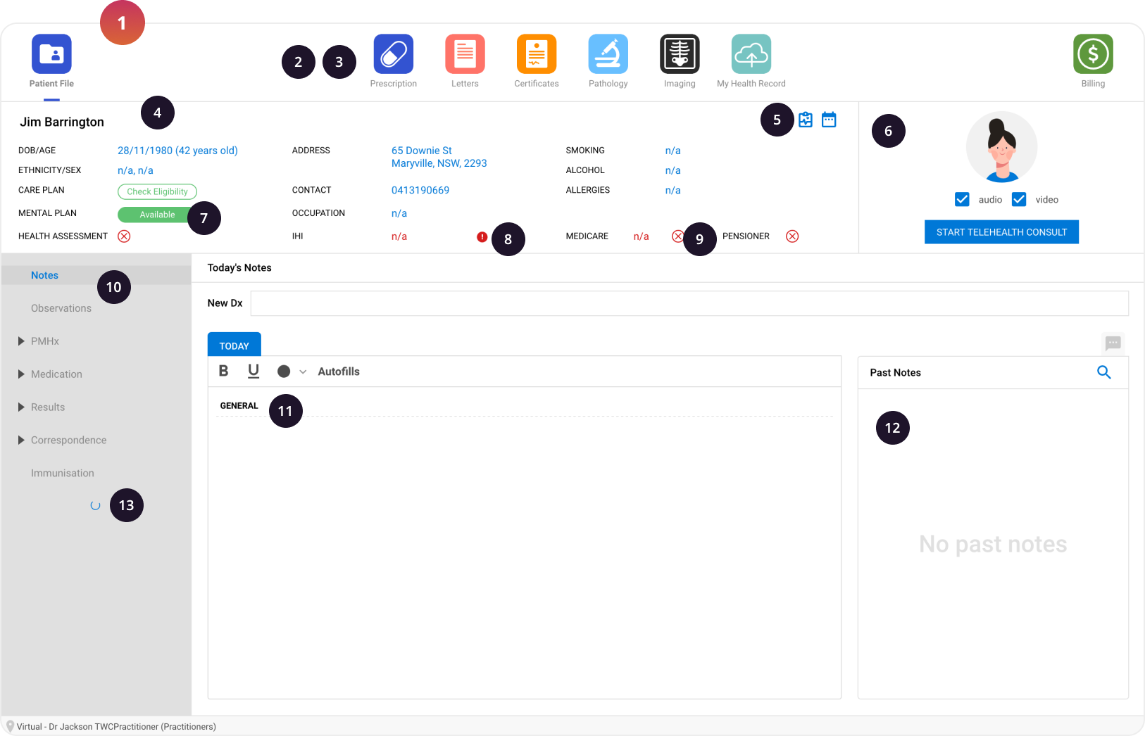
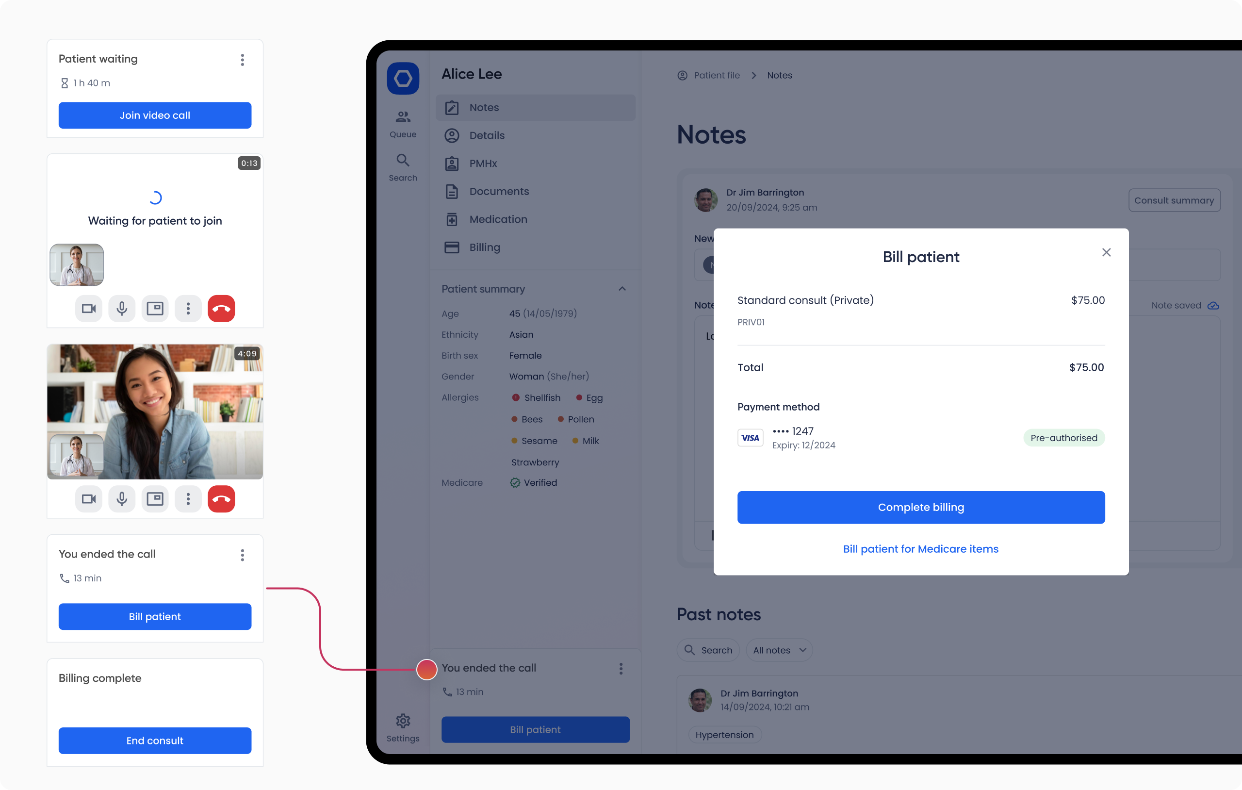
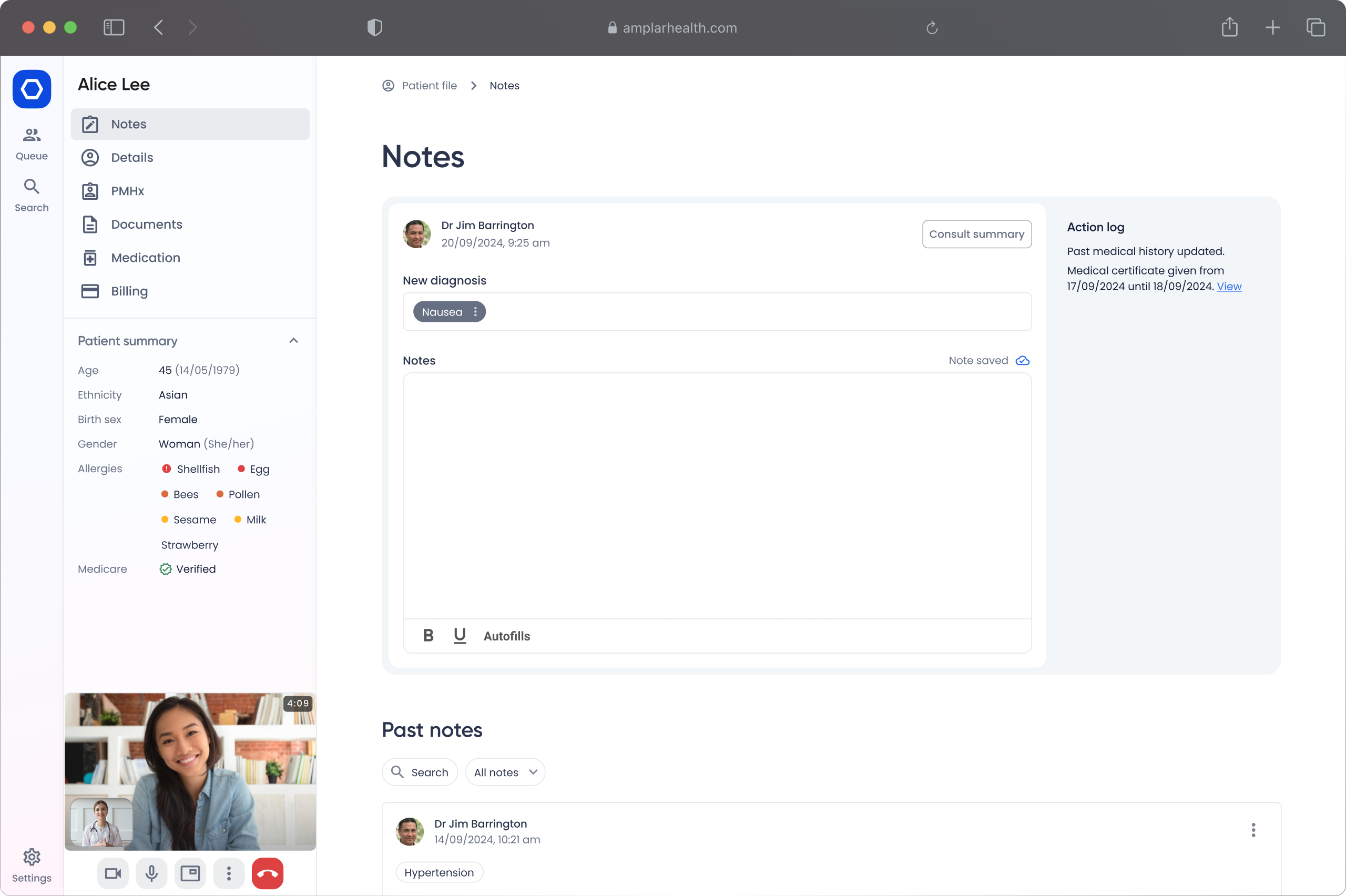
I developed a two-tier navigation system to consolidate the navigation patterns and create a predictable and familiar experience across the app. It comprises a Global Nav component and a contextual Section Sidebar which supports the nesting of sub-components, such as the Patient Summary, which previously displayed under the top navigation, taking up about 25% of the viewport height of the Patient File.
With the new navigation components and adjusted layouts to accommodate the changes, we were able to retire the multi-tab approach, creating a unified experience that users found intuitive.
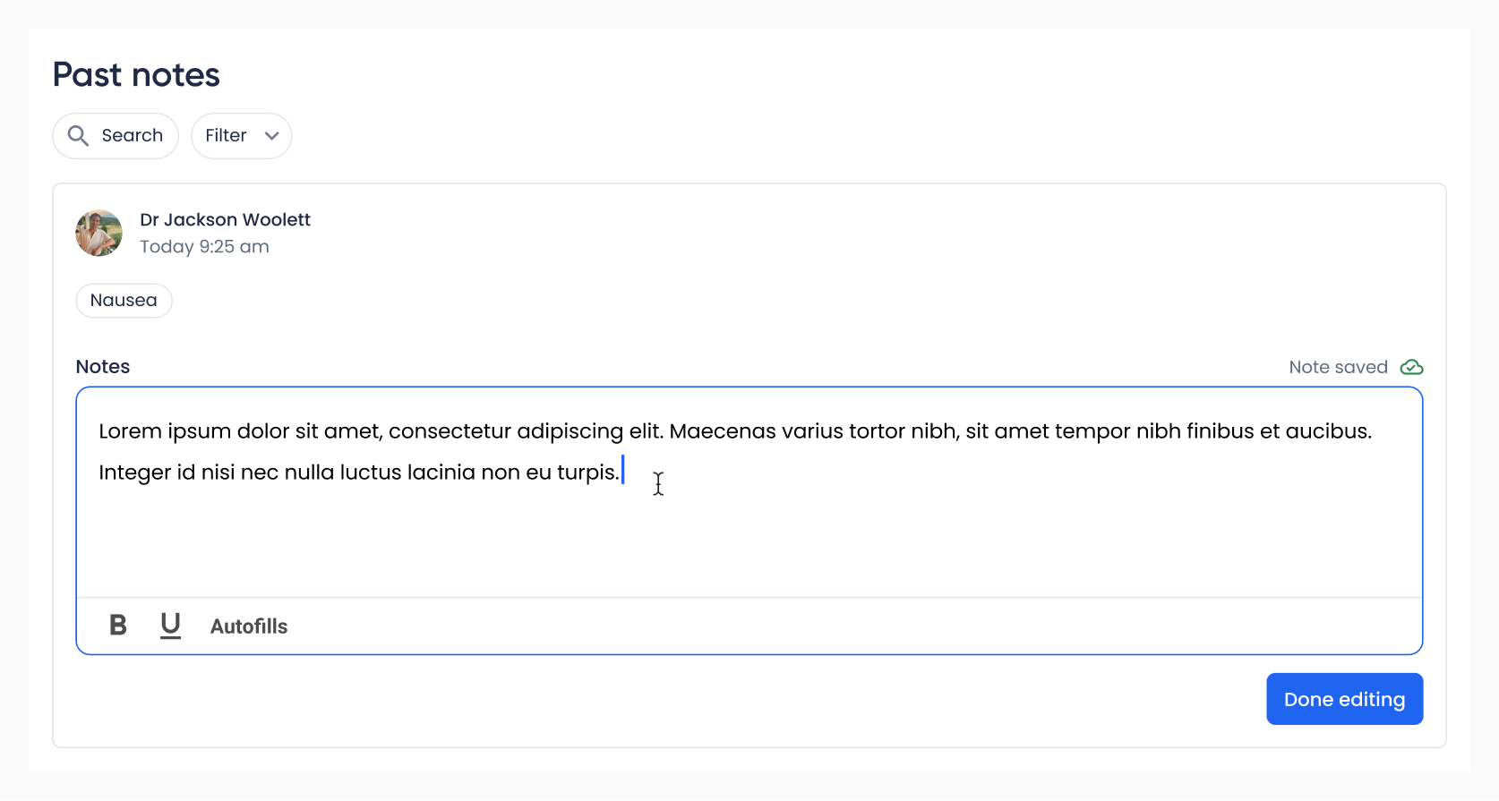
Maintaining flexibility
To ensure GPs could still use their preferred workflow I later redesigned the Consult Notes feature to allow doctors to edit a note from earlier in the day, while maintaining the integrity of the time tracking data.
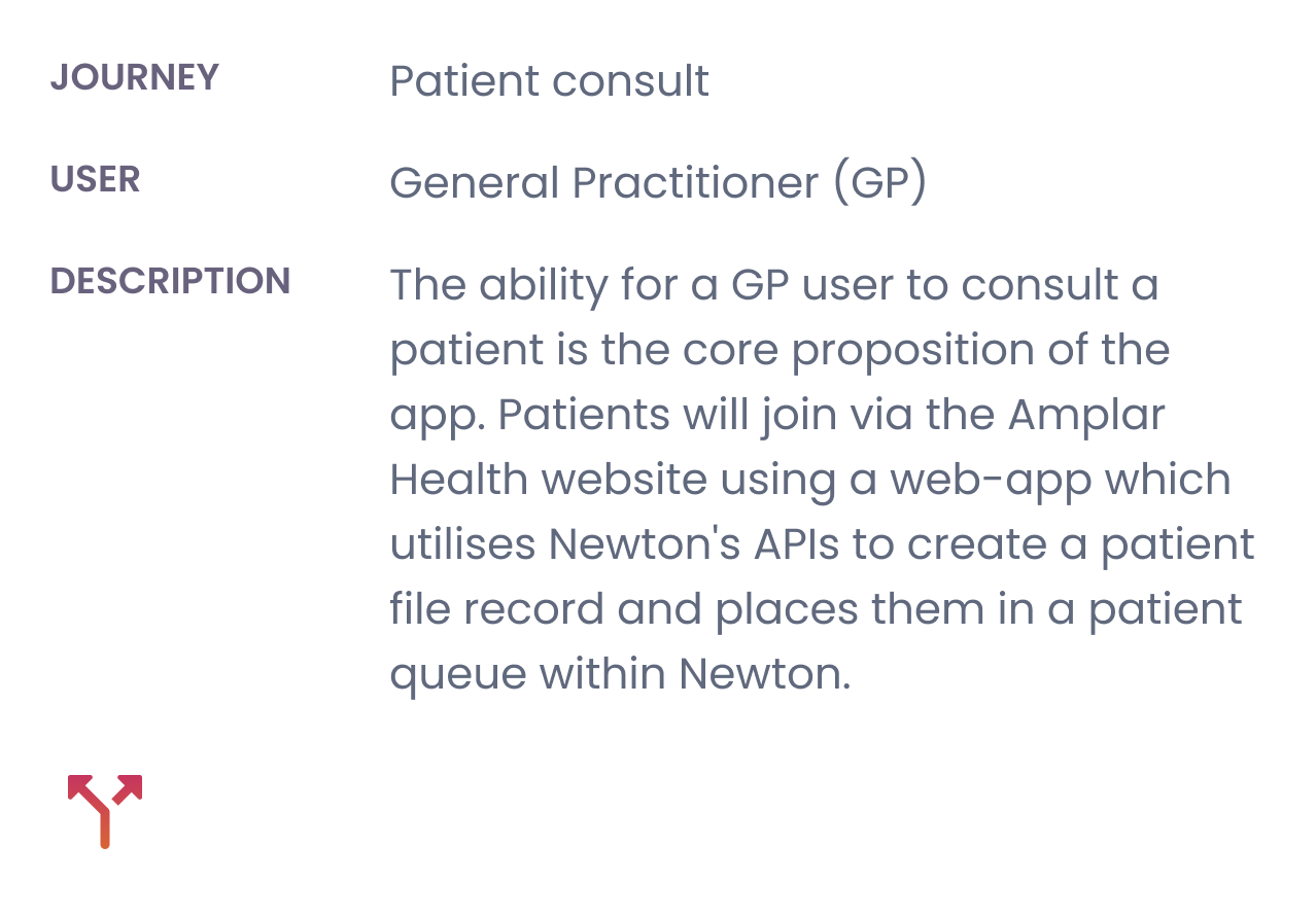
Optimising for telehealth
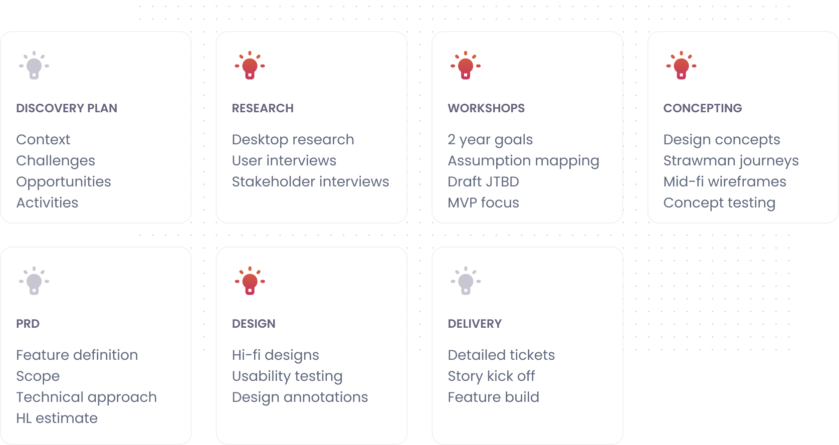
Refining our product Process
With significant work required to optimise Newton before launch, we needed to improve our efficiency. We refined Medinet’s product design process to align with the team’s UX maturity and resource constraints.
The updated process emphasises product thinking, lean research, and design courage.
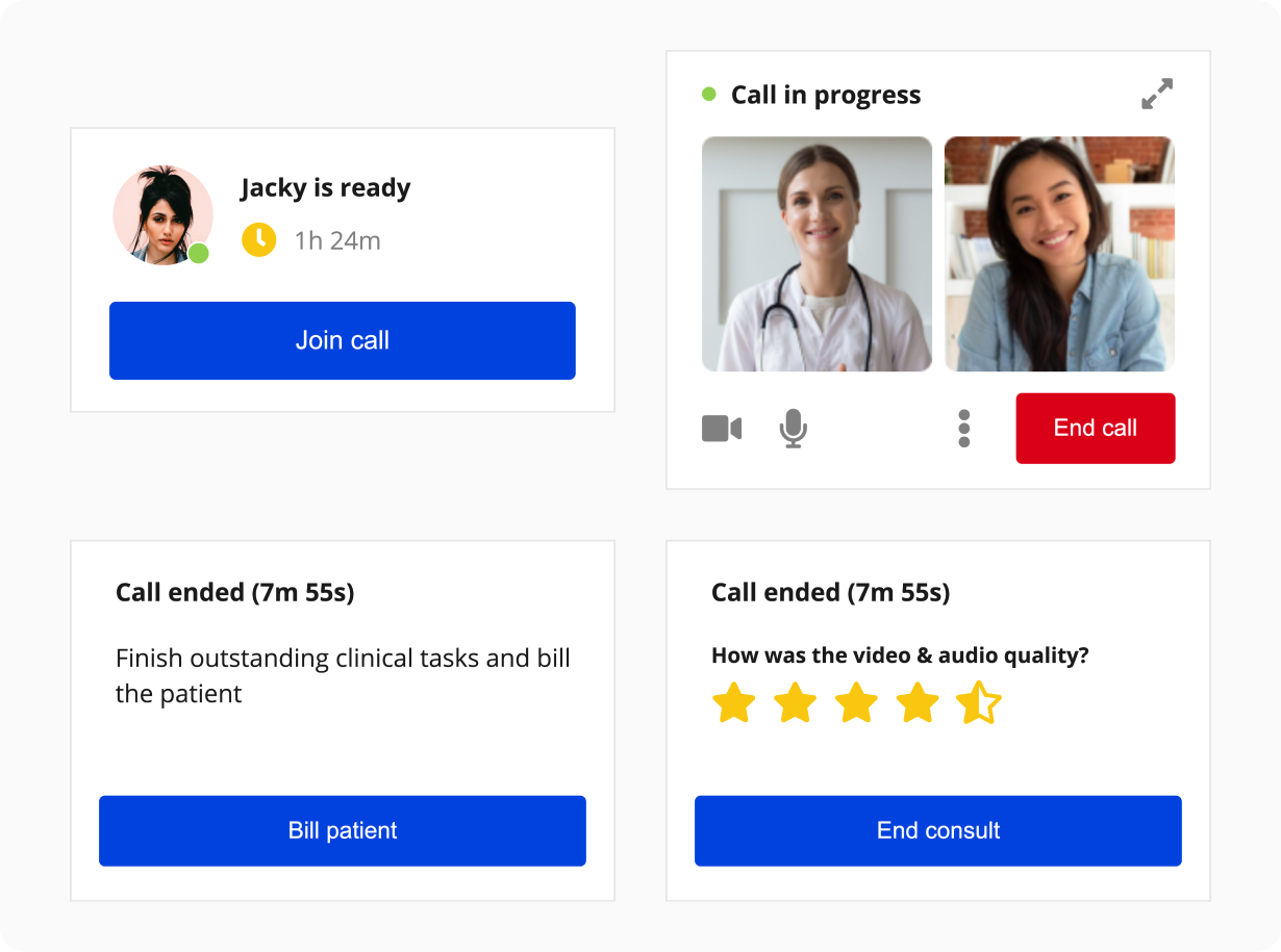
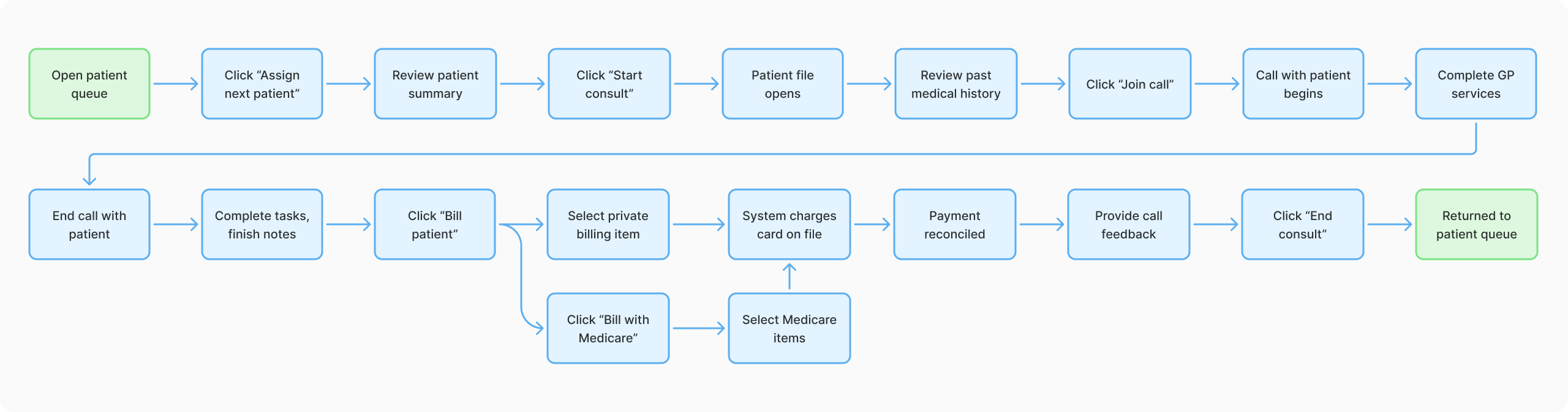
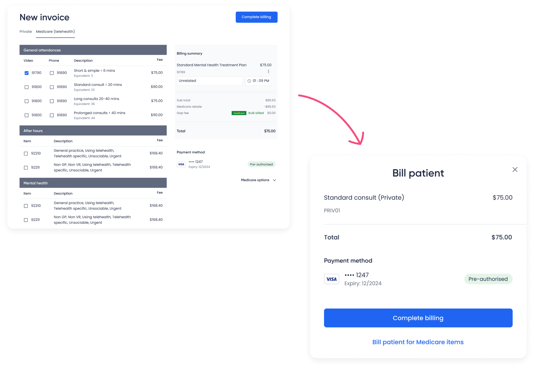
Patient billing
Discovery Research and workshops
We conducted desktop research to improve our understanding of healthcare system billing requirements, and collaborated with stakeholders and users to uncover key insights.
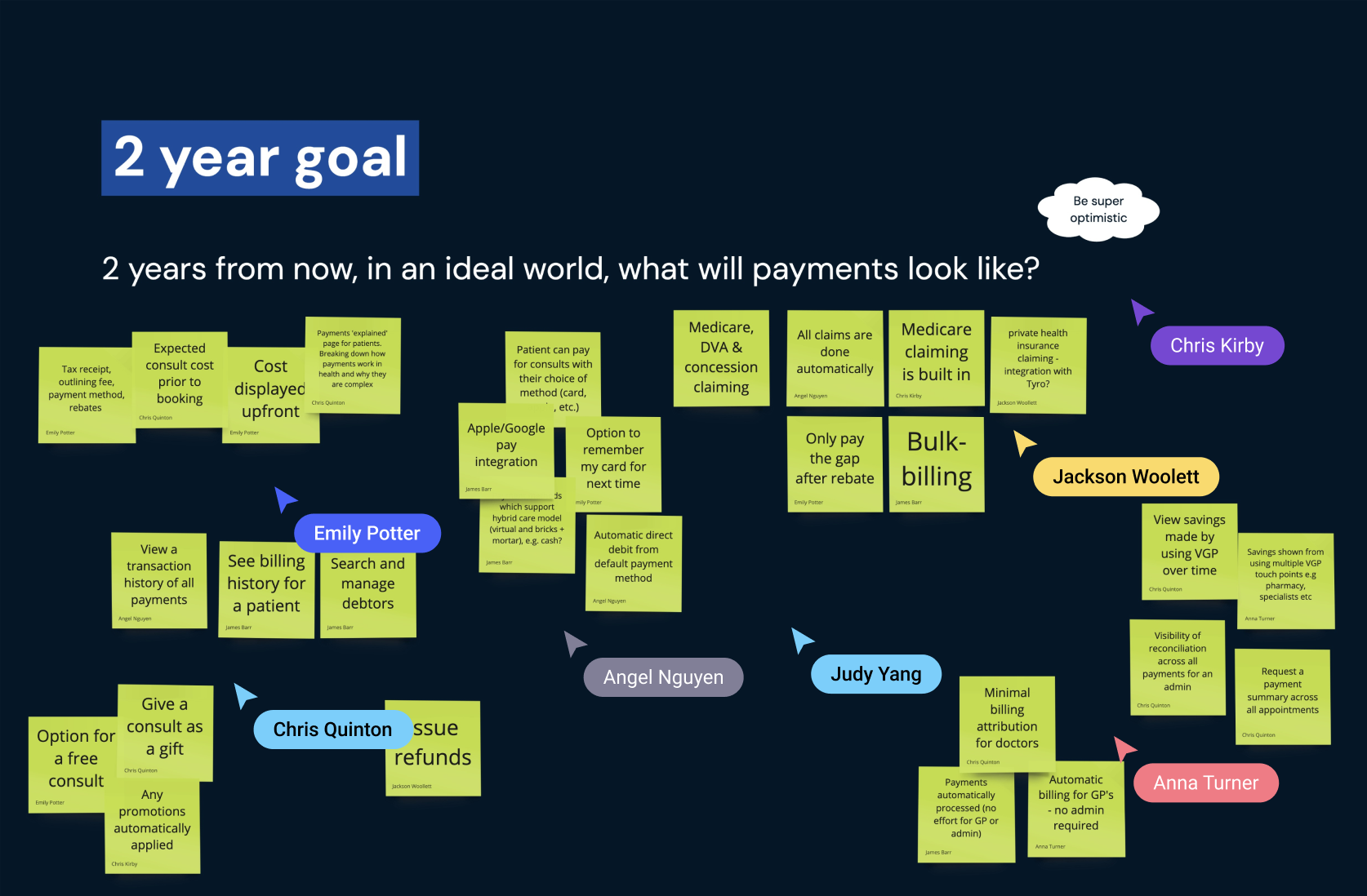
How might we…
How might we optimise the patient billing experience so that it can be completed efficiently by the GP, without the help of a practice admin?
Concept
Evaluating the Consult journey revealed an unstructured workflow, with GPs navigating the consult without guidance. The system did not require the completion of billing before ending a consult, as this task would have been completed by a practice admin in a physical practice.
I developed a concept for a new component that would guide GPs through the consult, creating a more structured workflow.
Interaction design
Created detailed user flows and wireframes in Miro for each JTBD, ensuring efficient task completion and business requirement were met.
Test and iterate
The existing billing flow required GPs to select billing items at the end of a consult, but didn’t account for telehealth-specific constraints, where most consults are billed privately.
To maximise engineering efficiency, we initially used the existing screen, but user testing revealed unnecessary friction. Based on this insight, I designed a simplified private billing experience that retained the option to bill with Medicare when needed.
Visual design
Developed and integrated the new Consult component into the design system, progressing wireframes from mid-fidelity in Miro to high-fidelity in Figma, organised by billing scenarios.
Impact
Improved user experience
The redesigned navigation, and optimised Consult flow with simplified Billing delivered a cohesive and intuitive experience, addressing pain points and effectively supporting GP workflows. Qualitative feedback from GPs was positive, preferring the new experience and finding it efficient.
More accurate data
The unified single-tab approach to navigation prevented GPs from keep multiple Patient Files open all day, which resulted in representative time tracking data.
Stronger team alignment and efficiency
The updated design system and clearer processes fostered better collaboration between the product and engineering teams, and enabled more efficient design and development.
Insights